
Co OPERATION: MultiTurn
Special Blog Post
I’d like to tell you a funny story about the logo you know and love/hate ;)
We started with a design that was doodled by one of our programmers, Rupert, with the help of his kids! That was tidied up a bit and lived for over a year.
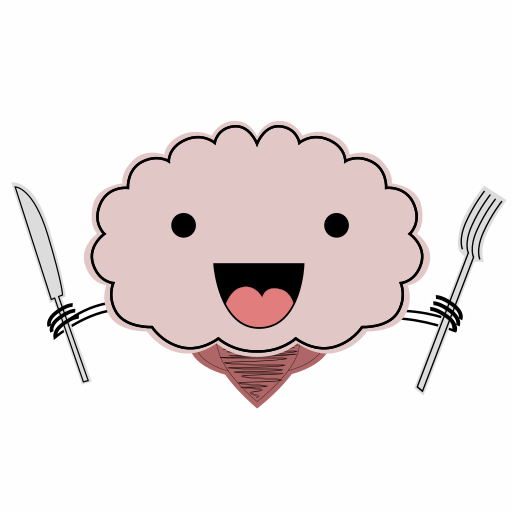
Obviously, programmer art is renowned for being a bit wonk so when we had time and money, Josh iterated upon it and vastly improved it!
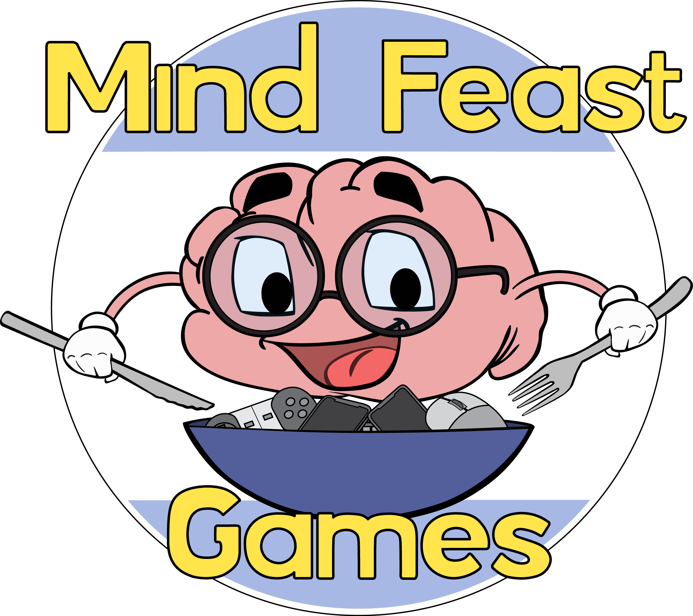
After a few months, a few people were kind enough to point out that our logo still wasn’t really “logo enough” so we resolved to iterate a bit more!
After a few sketches from Josh, we chatted about which ones we preferred. Joe, our programmer, then suggested that we might go a bit simpler with the logo and made a draft of his idea.

All of us were blown away!
We encouraged Joe to keep going. Joe made a few different ideas including if we were to do badges. The font proved especially contentious – deciding between formal and informal. We took several options of design and font to our Discord community and asked what they liked as well as the color scheme we should go with.
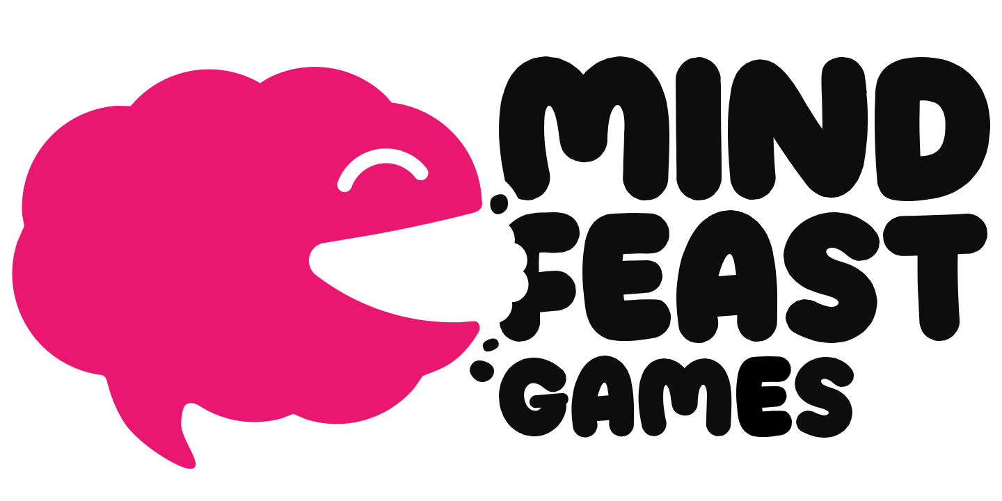
After 4 hours we then came to our adorable logo which now looks like this!
Leave a comment
Log in with itch.io to leave a comment.